A modern and responsive website is crucial in today’s fast-paced digital landscape. Consumers expect seamless online experiences, irrespective of the device they use. An outdated website can deter potential clients, while a responsive one adapts to various screen sizes, ensuring optimal viewing and interaction. As mobile browsing overtakes desktop, a versatile website design is no longer a luxury but a necessity. Dental practices must evolve with these digital demands to engage patients effectively and stay ahead in the competitive market.
Layout and Structure
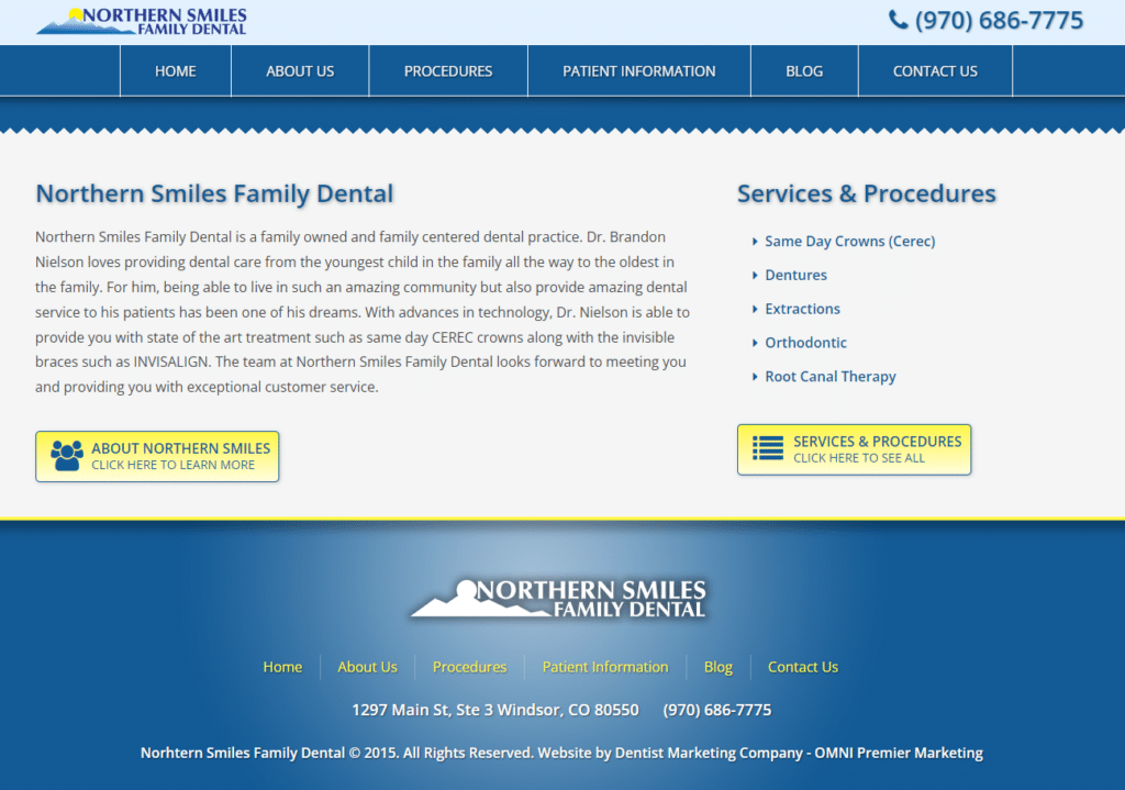
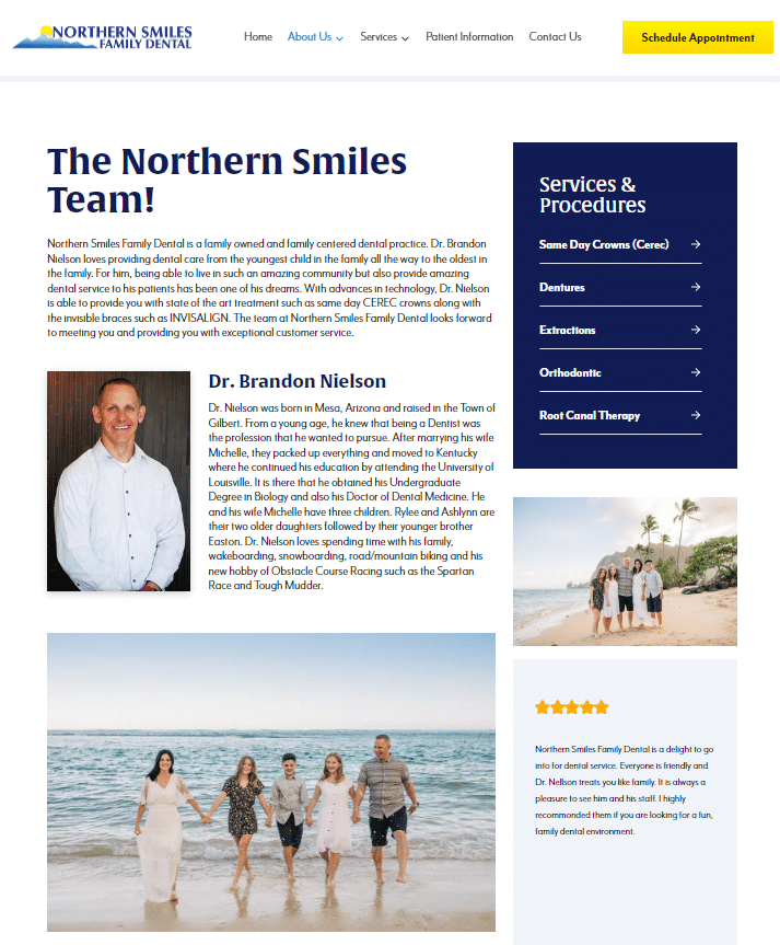
Omni Premier Marketing’s transformation of Northern Smiles Family Dental’s website is a testament to the power of modern design principles. The ‘after’ images showcase a layout that breathes simplicity and elegance, replacing clutter with clarity. This contemporary layout features clean lines and an organized structure, enhancing the site’s visual hierarchy and user navigation. Each section is deliberately placed, ensuring that visitors are guided naturally through the pages to find the information they need with ease.
The thoughtfully crafted structure emphasizes a strategic approach to information delivery. Content is no longer just presented; it’s showcased in a manner that is both appealing and functional. From the welcoming home page to the detailed service descriptions, every element is positioned to ensure a seamless user experience. Omni Premier has clearly prioritized the user’s journey, creating a website that doesn’t just inform but invites users to explore Northern Smiles Family Dental’s offerings in depth.
Color Scheme and Visual Design
The updated color scheme and visual design elements on the Northern Smiles Family Dental website mirror the latest trends in web aesthetics while maintaining the brand’s identity. The ‘after’ images reveal a palette that’s been refreshed, imbuing the site with a vibrant yet soothing ambiance that resonates with visitors. This new color scheme is not just about looking contemporary; it’s about evoking a sense of calm and trust—feelings paramount in the dental industry.
Furthermore, Omni Premier Marketing has skillfully employed whitespace, which serves a dual purpose: it draws the eye to key sections and allows the content to breathe. This use of space prevents the overwhelm that often accompanies densely packed information, ensuring that the website remains inviting and engaging. With each visual element carefully considered, the website now stands as a beacon of modern design that aligns with Northern Smiles Family Dental’s commitment to providing a welcoming and professional service.
Navigation and User Interface
Navigation is the cornerstone of usability, and the ‘after’ images reveal that Omni Premier Marketing has taken this to heart in their redesign of Northern Smiles Family Dental’s website. Menus have been streamlined, and call-to-action buttons are crafted to stand out, beckoning users to interact. This newfound prominence in navigational elements guides visitors intuitively through the site, fostering an effortless experience.
Omni Premier Marketing has not only updated existing content but also introduced new sections that provide comprehensive insights into dental services and patient care. These additions serve a dual purpose: to educate the visitor and to enhance the site’s SEO, ensuring that Northern Smiles Family Dental ranks prominently in search results. The refined content strategy positions the practice as an authoritative voice in dental health, inviting trust and interaction from current and prospective patients alike.
Functionality and Features
The transformation brought forth by Omni Premier Marketing is not just skin deep. The ‘after’ images of Northern Smiles Family Dental’s website reveal the introduction of advanced features that extend the site’s functionality. From online appointment booking to real-time chat support, these features streamline the user’s journey from inquiry to service. Such integrations indicate a commitment to digital convenience, aligning with consumer expectations in an increasingly online world.
Interactive elements such as sliders and galleries not only enhance the aesthetic appeal but also provide dynamic ways to present information. These improvements are a nod to the importance of an engaging user experience—a critical factor in converting website visitors into loyal patients. By enriching the site with these functionalities, Omni Premier Marketing has set a new standard for what a dental practice’s online presence can achieve.
Branding Consistency
In the competitive landscape of dental services, branding is pivotal, and the ‘after’ images reflect Omni Premier Marketing’s meticulous approach to maintaining brand consistency across the website. The updated design integrates Northern Smiles Family Dental’s logos, color schemes, and typographic elements in a harmonious fashion that reinforces the practice’s identity. This cohesion ensures that every page, every graphic, speaks with the same voice, building a brand narrative that patients can recognize and relate to.
The consistency in branding extends beyond aesthetics; it’s about establishing a reliable presence that patients can trust. Whether it’s through the color of the navigation bar or the font of the service descriptions, the brand’s ethos is communicated with clarity and precision. With Omni Premier’s expertise, Northern Smiles Family Dental’s website stands as a testament to a well-crafted brand, one that promises and delivers quality care to every visitor.
Homepage
Before the Transformation
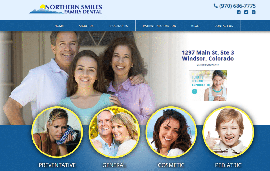
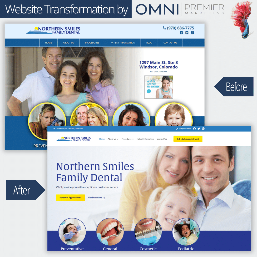
- Header Layout – The site prominently displayed the clinic’s name and logo at the top. Contact details, including phone number and social media icons, were on the top right.
- Main Image – Featured a family portrait, indicating a family-oriented service.
- Service Icons – Four primary services (Preventative, General, Cosmetic, and Pediatric) were highlighted using circle images with labels beneath them.
- Navigation Menu – It was a horizontal bar beneath the header. The color scheme was primarily blue.
- CTA (Call to Action) – There was a noticeable “Schedule Appointment” button next to the address.
After the Transformation
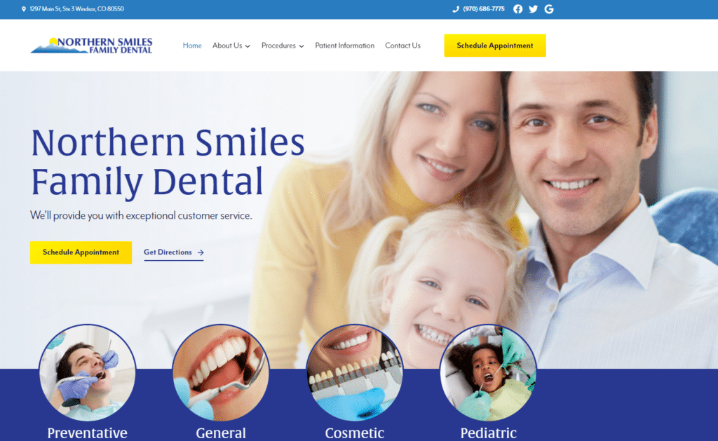
- Header Layout – The site prominently displayed the clinic’s name and logo at the top. Contact details, including phone number and social media icons, were on the top right.
- Main Image – Focus has shifted to a close-up image of a family, which gives a more personal and welcoming touch.
- Service Icons – The service icons now appear more modern and visually appealing. The images used are also different, emphasizing the procedures and treatments rather than the patients.
- Navigation Menu – The menu remains horizontal but has adopted a more minimalist design, and the color scheme seems to be more subdued, emphasizing whites and light grays.
- CTA (Call to Action) – The “Schedule Appointment” button remains but has been redesigned to be more eye-catching with contrasting colors.
More Observations
- Modernization – Omni Premier Marketing has given the site a more modern, cleaner look, making it appear more professional and user-friendly.
- User Experience – The newer design feels more intuitive and streamlined, which could enhance user experience.
- Color Palette – The updated website adopts a softer color palette, making it look more sophisticated.
- Image Choices – The images in the updated design are brighter and of higher quality, which adds to the professional feel.
In conclusion, Omni Premier Marketing has transformed Northern Smiles Family Dental’s website into a more contemporary, user-friendly platform while still retaining the core branding and messaging. The design changes are subtle yet effective, enhancing the overall visual appeal and functionality of the site.
Services and Procedures
Header & Logo
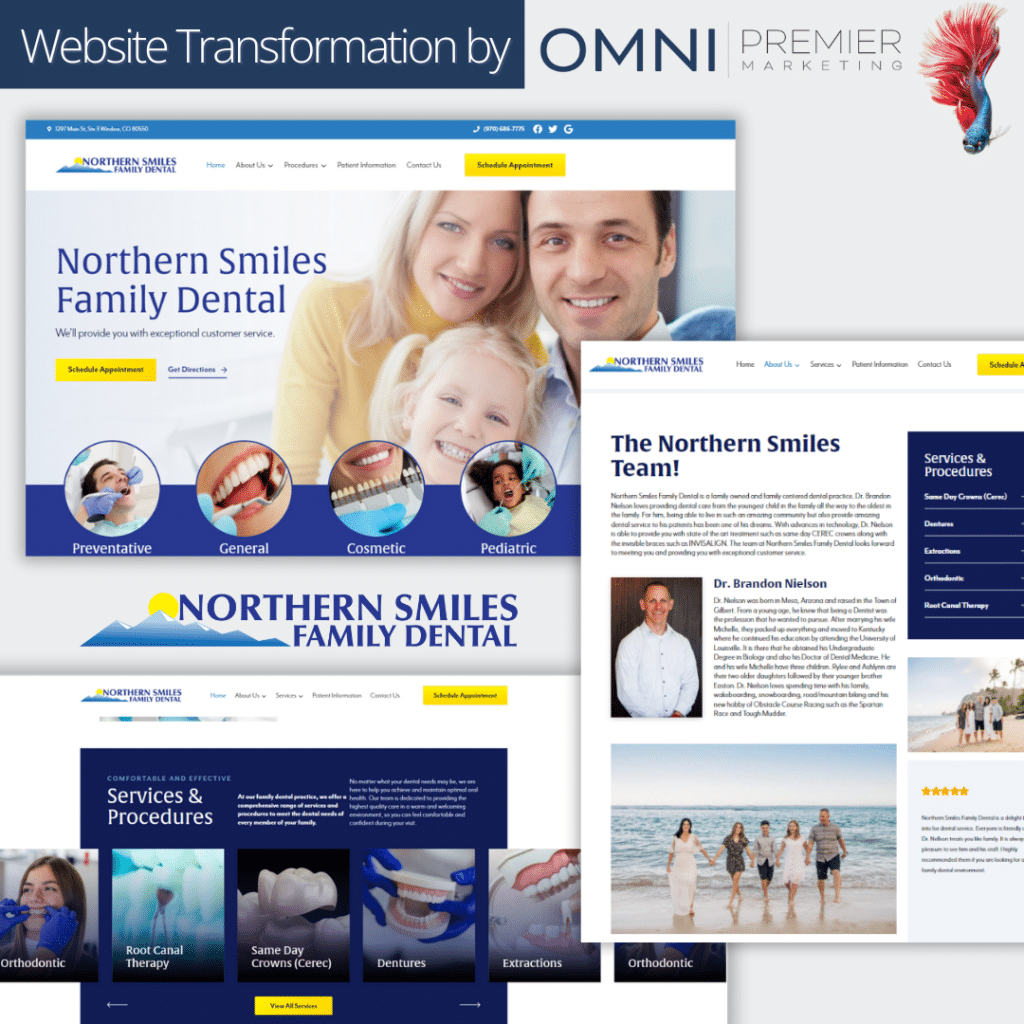
The logo remains consistent in both designs, but in the new design, the placement is more centralized and it is more prominent.
The main navigation menu in the new design is more streamlined and placed below the logo, offering a cleaner look.
Imagery
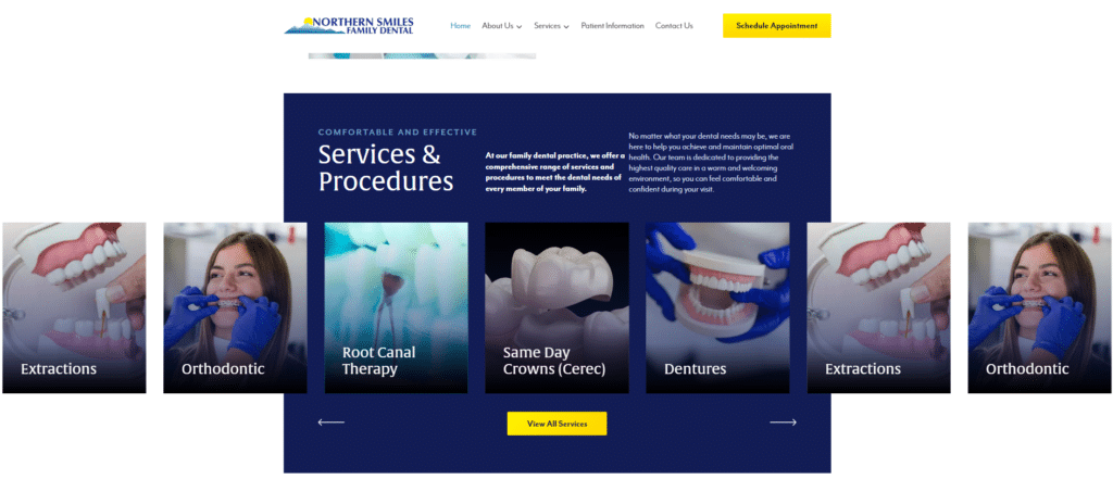
The initial design predominantly utilized textual content with minimal visual elements.
The new design incorporates more imagery, showcasing dental procedures and services. These images help in visually conveying the services the clinic offers and can make the website feel more engaging to users.
Content Organization
In the original design, there was a sidebar on the right showcasing various services. This has been replaced in the new design by a central layout that utilizes visual cards or tiles for each service, providing a more modern and aesthetic touch.
Color Scheme
The updated design maintains the same blue color scheme but uses it more effectively with better contrast. The blue appears richer and is used in backgrounds, while white is utilized for text, creating better readability.
Call to Action
The new design prominently features a “Schedule Appointment” button at the top, making it easier for visitors to understand where to click if they wish to book an appointment.
Typography
The typography in the new design looks more modern and is better spaced, enhancing readability and overall aesthetics.
Services & Procedures Section
As mentioned, the new design uses visual cards for services, offering a snapshot of each procedure. This can be more appealing to users, as they can quickly understand the services through both text and visuals.
Textual Content
The new design has concise and clear textual content with an emphasis on comfort and the quality of service, targeting potential patients more effectively.
Footer
While not entirely visible in the images provided, it seems the footer has been simplified, offering essential information and contact details more straightforwardly.
From the transformation, it’s evident that Omni Premier Marketing focused on modern design principles, emphasizing visual appeal, user experience, and effective call-to-action elements. They transformed the website to be more user-friendly, visually appealing, and efficient in communicating the clinic’s services and values.